
Breakdown
This project focused on redesigning the wayfinding and signage systems that are currently in place at the Toronto Eaton Centre. Due to the lack of of brand identity, brand consistency throughout applications and formatting issues, it was deemed necessary to theoretically update this system to benefit all visitors.
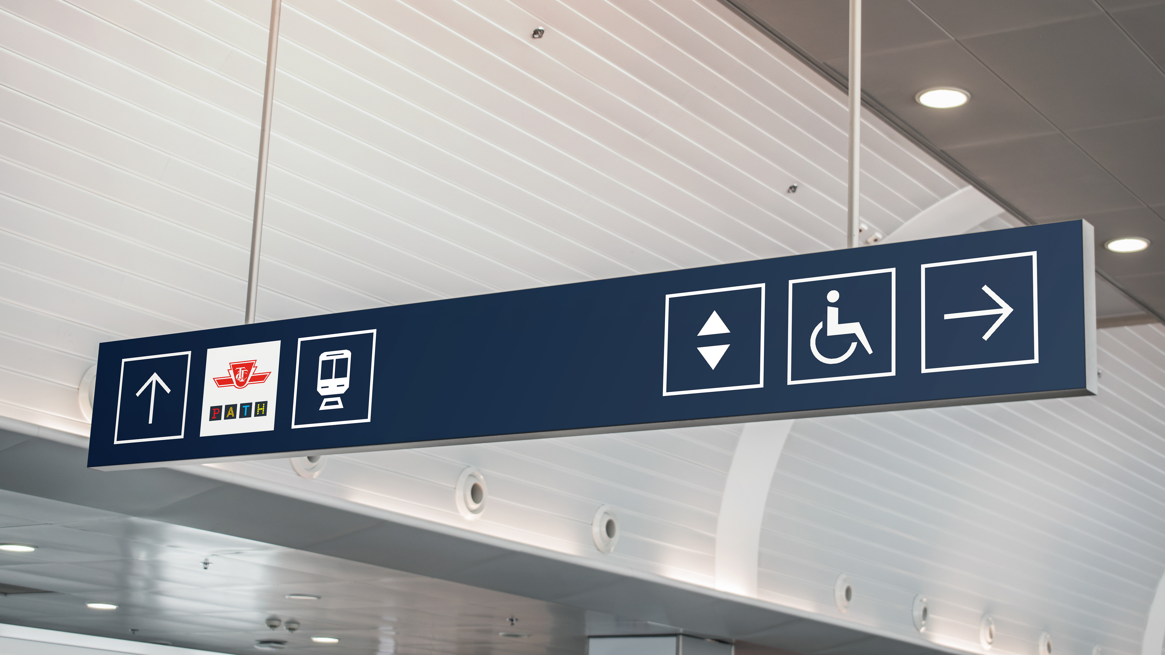
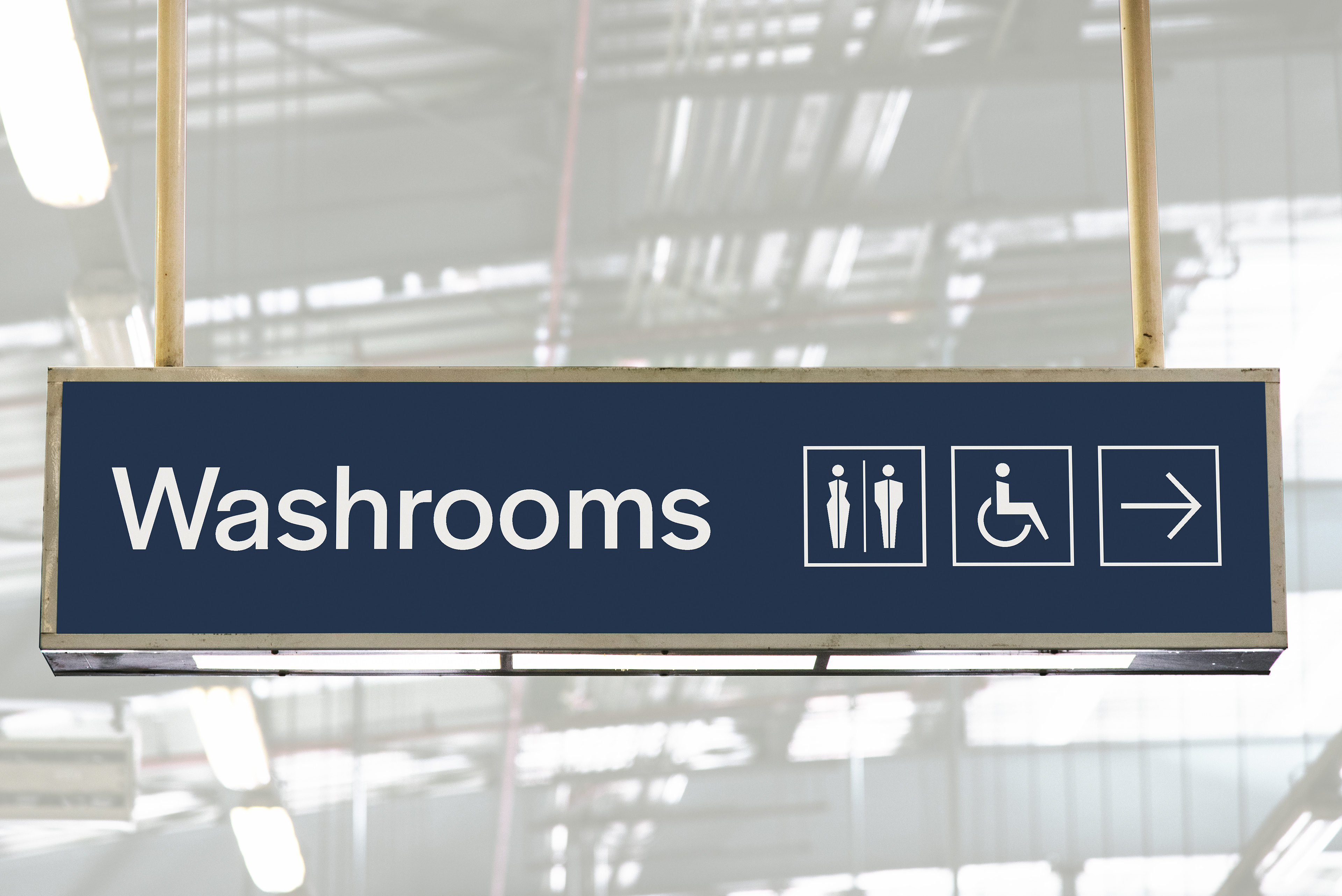
The final renders of the refreshed signage displays the brand palette in a system of wayfinding that is both more cohesive and reflective of the Eaton Centres identity. Unlike existing the signage in place, this new system incorporates the brand colours to create a familiar and consistent series of signage that aligns with the new identity. Additionally, the colour red is utilized as a contextual element which assists visitors by indicating which level they are currently on. Iconography was also updated in the process of the redesign; putting more focus on legibility and effectiveness with a more simplified execution.
Target Audience
As a shopping centre, the Toronto Eaton Centre attracts a wide-spread demographic of visitors each year. Majorly, teens and young adults of all genders in the 16-30 age range, along with families who all use the space to browse and shop for a variety of lifestyle and clothing goods.


Tools Used
Adobe InDesign
Adobe Illustrator
Adobe Photoshop


